Jetpack Compose is a declarative UI framework built for Kotlin Android Developers who want to build apps using a reactive programming model similar to React Native or Flutter. It was introduced in 2019 becoming stable in 2021. This article will be a simple beginners guide to compose for new developers and also a guide to veteran Android devs looking to transition from XML.
Is compose necessary?
The paradigm is shifting more towards the declarative way of building UI in modern mobile applications. Mostly due to the influence by many of the declarative UI building frameworks such as Flutter, React and SwiftUI. The major thing these frameworks have is the ability to be cross platform except for Swift of course which is for only the IOS platform. Other than the cross platform ability, declarative UI has proven to be powerful and it is very evident by the beautiful UIs built out there by incredible developers. Android desperately needed this upgrade , it needed a bite of this goodness to evolve into the next level.
Imperative vs Declarative UI building
So what is imperative and declarative UI building:
Imperative UI : It involves having a separate model of the applications UI. For example we use a separate XML file where we declare and position all our widgets within a container. This style of UI building focuses on the how rather than the what
Declarative UI: This new paradigm allows developers to build or model the UI around the data being received. This focuses on the what rather than the how. Some examples of frameworks that follow this paradigm other than Jetpack compose include :
- React Native
- Flutter
- Swift UI
Advantages of compose over XML
- Less code - compose allows you to do more with less amount of code compared to XML and its view system. For example, the implementation of a scrollable list using a recycler view in XML requires you to create the recycler view in xml then connect it to an Adapter which you build as well. In compose you just need to use a LazyColumn.
- Compose is highly intuitive. You just need to describe your UI and compose will handle the rest under the hood. The APIs built for compose are intuitive and are easy to discover and use.
- UI built by compose is highly modular can be re-used in different places especially when you apply concepts like state hoisting which we will cover later. For example a product card built for one LazyColumn that contains a list of products can be re-used in another LazyColumn with the products list on a different screen.
- Fast and powerful. Compose has highly improved build time of applications during development. This saves a lot of time.
Key terminologies to keep an eye out in compose
1. Composable
A composable is simply a function that describes a UI component. It ranges from an entire screen to a widget. All composable functions are annotated with the @Composable annotation. This will tell the android compose compiler that the function described below is intended to be converted to UI. Below is an example of such a function:
@Composable
fun WelcomeMessage( name : String ){
    Column(
           horizontalAlignment = Alignment.CenterHorizontally ,
            verticalArrangement = Arrangement.Center
          ){
              Text("Hello World. My name is $name")
          }
}
As you can see , composables also can take parameters to be used within the function. In the example above, the composable function takes in a name parameter so that it can be used by the Text widget to show the name of the user on the screen. You can pass any data type as an argument , Int , Lists custom data classes .e.t.c.
2. Modifiers
According to the official Android documentation modifiers allow decoration and augmentation of composables. To give a closer analogy on this , think of composables like the body of a robot and modifiers as the code and electricity that gives artificial life to it. Without the code and electricity the robot is inanimate and useless. In the same manner, Modifiers give composables:
- Size , layout , behaviour and appearance
- High level interactions such as click beviour , animation or scrolling ability
- Ability to process user input
   Button( onClick = { addToCart() },
                modifier = Modifier
                        .fillMaxWidth()
                        .padding(16.dp),
                shape = RoundedCornerShape(10.dp)
                ){
                  //button text
                }
The example shows a simple Button widget composable and it has a modifier in it. The modifier defines two attributes , fillMaxWidth() which simply specifies the button should occupy the whole width of its parent layout. The the other cool thing about Modifiers is that we can chain multiple attributes. In the example above another attribute padding() has been added to the Modifier which specifies the space that should be created around the button itself on the screen. We should be careful though as the order which you chain your modifiers is important. This is because each function makes changes to the Modifier being returned by the previous function, therefore the sequence affects the final result. Further deep dive of modifiers can be found in the developers official documentation.
3. State
State represents a possible form of the UI at a certain point in time. This form can change or mutate. Examples of state include:
- Showing a list of items coming from the local database or API
- Showing a progressbar when loading items
Co-relation between state and compose
Compose is declarative meaning that the only way to update the screen is calling the same composable with new arguments. These arguments are representations of the UI state. Anytime a state is updated a recomposition takes place. Therefore , a composable has to explicitly be told the new state in order for it to update accordingly. This is vastly different from the XML based UI approach which simply automatically updated the view's state.
By default composable functions are stateless. When you create a textfield composable and run the application, you will notice that the textfield does not show any text when you type letters into it. Wondering why? This happened because the composable had no state defined and it didn't get recomposed with the new values that had to be displayed. Further deep dive into states will be handled in part two of this series.
Composables life cycle : Composition , Initial composition and recomposition
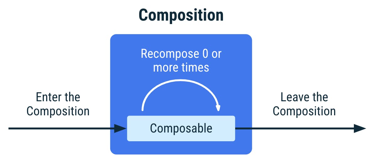
When a composable is created then run on a device, it goes through these three states:
1.Composition: a description of the UI built by Jetpack Compose when its executed
2.Initial composition: creation of a composition by running composables for the first time
3.Recomposition: re-running the composition to update the composition when data changes. Recomposition is typically triggered by a change to a State object.
4. Side effects
A side effect in jetpack compose is something that escapes the scope of a composable function for example collecting flows , this will execute and escape the scope of a composable. Therefore when the composable gets recomposed, the flow collection will be triggered again. Collecting flows within a composable is bad practice hence it is advised to collect flows in compose effect handlers. There are many effect handlers in compose each with its unique way of handling different side effects that may occur in a compose application. It is good to know the work each handler does so that you know what to use in a given scenario. More is covered here in the official documentation
UI layering in Compose
UI in compose can be arranged in four forms or ways: columns , rows, boxes and lists:
Columns
Columns allows you to arrange elements vertically. They have two ways in which you can position elements within it:
- verticalArrangement : this is the arrangement of elements within the y axis. Elements are arranged from top to bottom on the y axis.
- horizontalAlignment : this is the alignment of the whole block of elements on the X axis. So left or right.
Columns can be made to scroll vertically by the use of a Modifier but they are not suitable for large lists as they are not optimised for that. For large lists LazyColumns or LazyRows are recommended
Rows
Rows allows you to arrange elements horizontally. Just like columns , they also have two ways you can position elements :
- verticalAlignment : will move whole block of row elements on the y axis. So left or right.
- horizontalArrangement: will arrange individual elements within the row on the x axis.
Boxes
Boxes stack elements on top of another. The element that starts in the box is the element that will be at the bottom of the stack.
Lists
For me this was one of the coolest components of Compose that I got to know of.
- LazyColumn : is just like the recycler view in traditional android UI design without the need of a recycler adapter and a separate list Item. Renders elements only visible to the screen. Designed for long screens.
- LazyRow : just like horizontal recycler view. Scrolls horizontally.: just like horizontal recycler view. Scrolls horizontally.
- LazyVerticalGrid: lazy vertical grid has the same behaviour as a LazyColumn in that it can scroll items in it vertically (from up to down and vice versa). The difference comes in arrangement of the items. A LazyVerticalGrid arranges its items in a grid format and can be set to a fixed number of columns or adapt to the size of the screen.
- LazyHorizontalGrid: this is the counterpart to LazyHorizontalGrid , the difference comes in how the grid will scroll. A LazyHorizontalGrid scrolls the items horizontally (from left to right and vice versa)
Running your first jetpack compose application
Phew! That was a lot to learn and take in. Now its time to know how to run your first compose application on Android Studio:
Pre-requisites
- Knowledge of Kotlin programming language
- Farmiliarity of Android Studio IDE , if not check out the official documentation
- Minimum Android Studio version : 2020.3.1 Arctic Fox
Lets start the fun!
Project creation
Launch Android Studio IDE on your PC. On the welcome screen, select new project and a project selection window will appear.
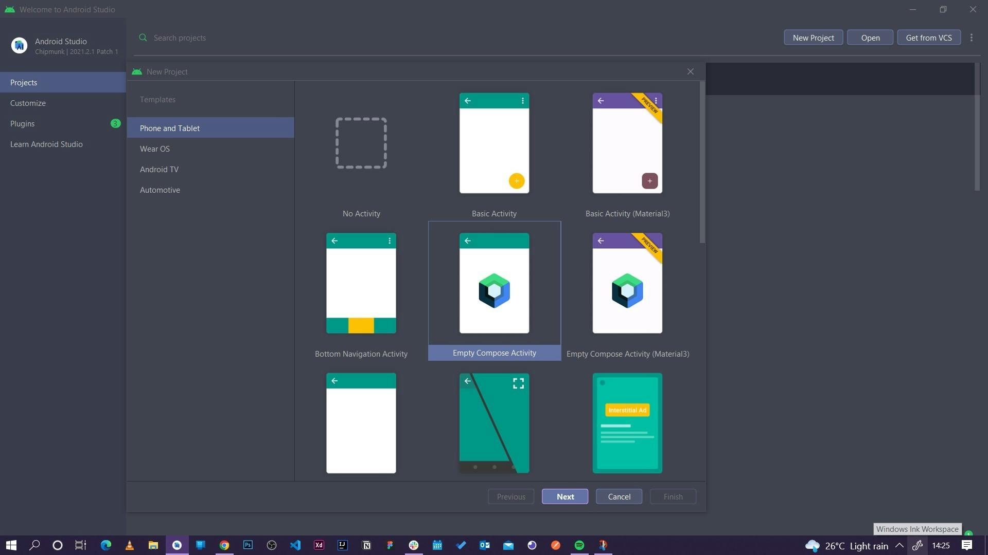
As you can see Android Studio offers different types of android projects you can create depending on what your app idea is targeted at. Your idea could be an app for a wearable device i.e wrist smart watch , a maps appliciation , tv application e.t.c Android Studio provides for you a platform to build any type of android app. Forget about all the other types, we are here for compose. Select an empty compose project and click on next.
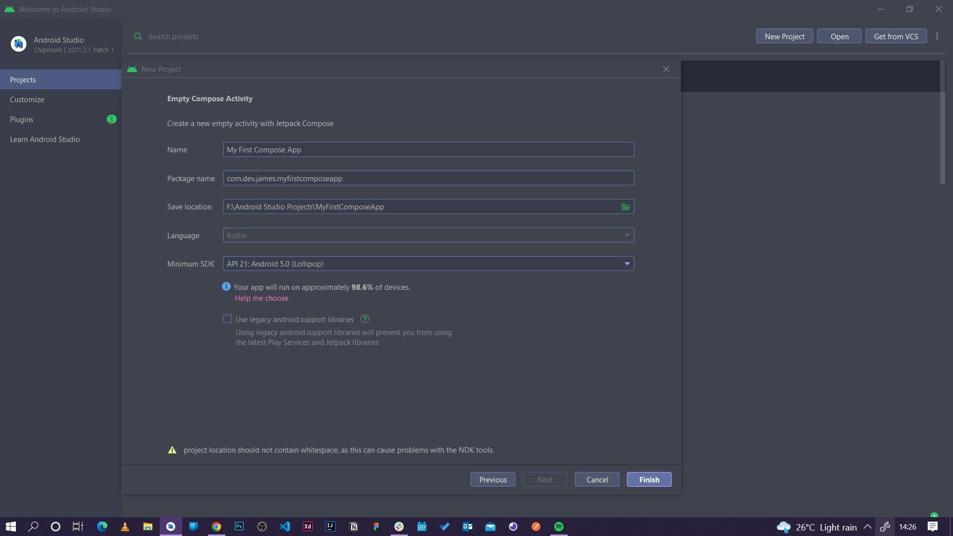
Next is to configure your application's identity. Give it a name and in our case call it My First Compose App. The rest of the fields , leave them as they are and click on finish.
NOTE: the Minimum Sdk field defines the minimum version of android that can support the app you are creating. By default it is set to API v21 5.0 Lollipop. This ensures that your app will run on 98.6% of devices currently available on market. This means any android device that supports version 21 5.0 Lollipop or higher will be able to run your application. Selection of a version below 21 will most likely bring issues to your project as versions below don't support Jetpack Compose.
Wait for your project to build and boom! You have successfully created your first Jetpack Compose application.
Compose code breakdown
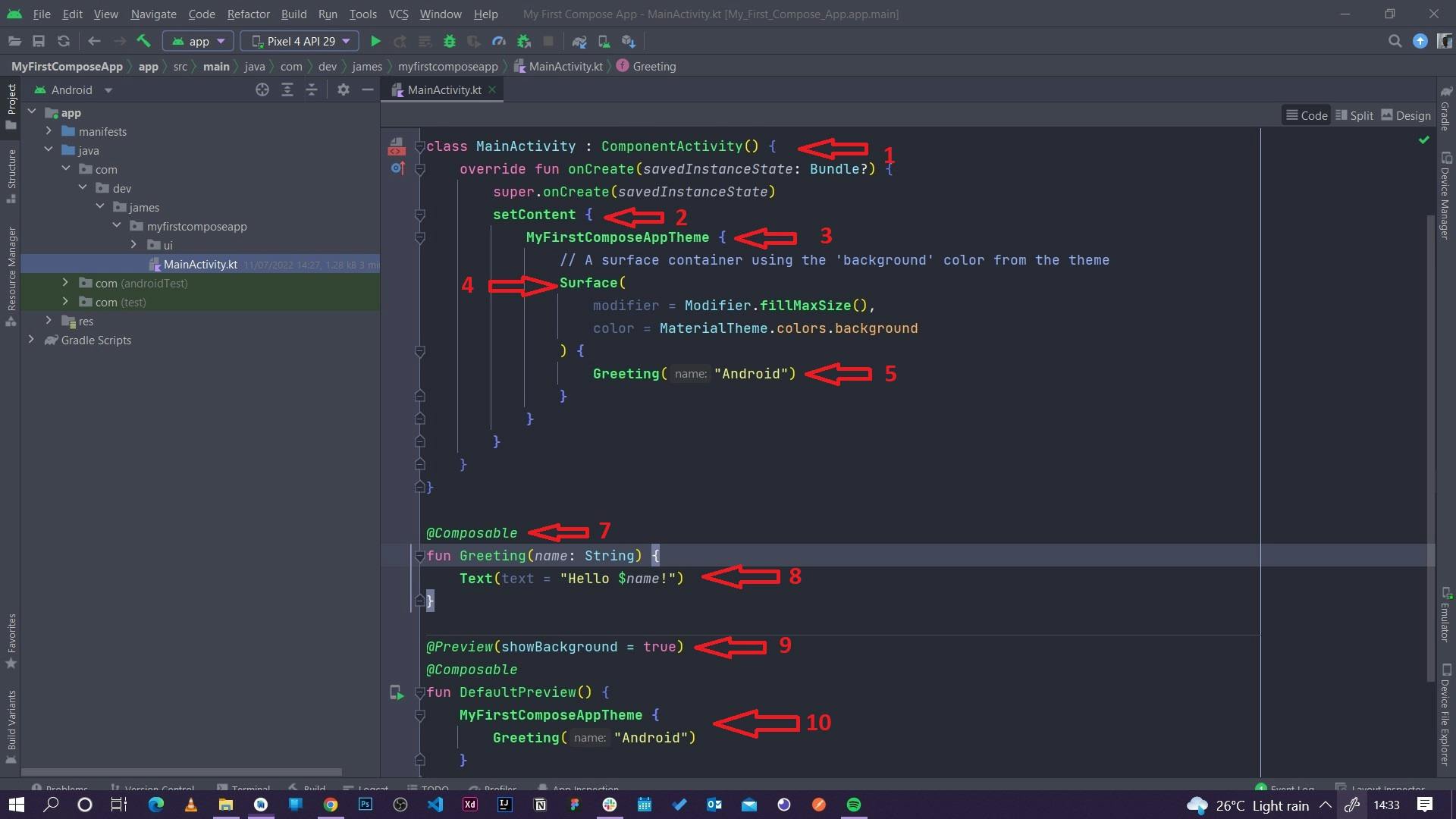
After a successful build you will end up with a screen like this. Confusing? Yes I know but let me try to break down what you are seeing in the best way possible. Following the red arrows order:
1. MainActivity class: this is the parent activity. This is also whatever screen the users will see on the mobile phone when the app is opened. Therefore we can say that this class is the window to which UI elements will be rendered.The class inherits from the ComponentActivty class. It enables composition of higher level components within a class. This extended class contains all you need for a compose only app. Further reading here
2. setContent: this block defines the activity's layout where composable functions are called. So all the composables that we are going to create in the future will be called within this block so that they can be rendered on screen. The setContent block has the same functionality as the setContentView from the xml based approach of UI building. Also remember , composables can only be called from other composables.
3.MyFirstComposeAppTheme block: this defines the main theme of the application. So things like color , text fonts , text sizes e.t.c all fall under the apps main theme. Wrapping your composables within the application's main theme block , in our case MyFirstComposeAppTheme block, will ensure our composables inherit the same styles as defined in our theme file ensuring consistency across the application.
4.Surface composable: this composable explicitly indicates that the code uses a material surface from the Material Library. It also makes writing of composable functions much easier. Surface is also the equivalent of a CardView in the view system , you can set elevation for the view using this composable as well.
5. Greeting composable: a simple composable function that takes in a text string as a parameter to be used within the composable.
6. Composable annotation: an annotation which that defines the function below it as a composable function.
7. Greeting composable function: a simple composable function that takes in a string as a parameter and uses the string within a Text composable. This approach makes the Greeting composable reusable across the application. Therefore you can pass any type of string within the composable.
8. Preview annotation: this annotation lets you preview your composable functions within Android Studio without having to build and install the app to an Android device or emulator. To see the preview , in Android Studio on the far right side , just next to the Gradle and Device Manager tab, you will see the tabs nameley: Code , Split and Design.
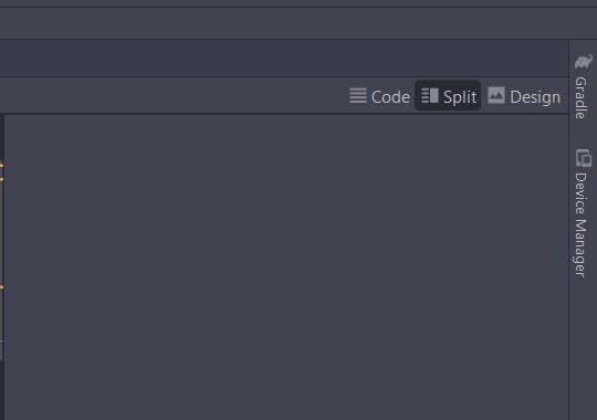
Select split and you will see the preview within the pane. If you do not see the preview you will be required to rebuild the application. On the IDE top panel , select Build then Rebuild , wait then the preview will show.
9. Default Preview composable: the preview annotation must be used on a composable function that does not take in parameters. For this reason, you can't preview the GreetingsCard function directly. Therfore we make the DefaultPreview function composable and call in our Greeting composable with the correct parameter.
Wow that was alot right? But we are almost there! The final step is to make it a bit interesting. On the Greeting composable call within the setContent block , change the greeting text from Android to your name.
Running your first compose app
Select your device on the top of your IDE then click run or the little green play button. Wiat for the IDE to build your app , launch your emulator then run your app. It should be looking something like this:
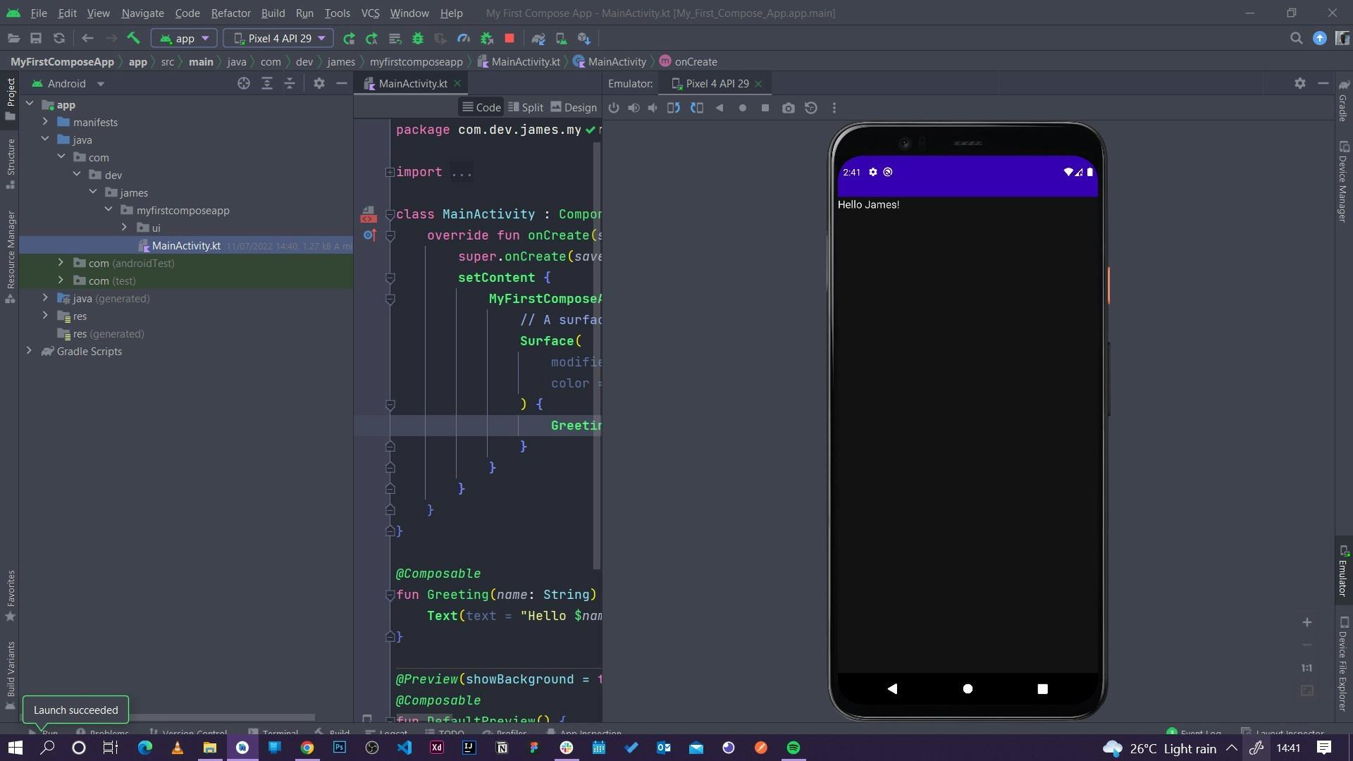
Congratulations! You have successfully created and run your first compose application!
Conclusion
This is what you have learnt:
- What imperative and declarative UI building is together with their differences.
- Advantages of compose over XML.
- The key terminologies to watch out for in Jetpack Compose which includes what a composable function is , the composable annotation , modifiers in compose , state and its co-relation to composable, initial composition , composition , recomposition and side effects.
- We took a look at various containers used in compose and defined their behaviours: columns , rows, lazy columns, lazy rows and lazy grids.
- Finally we looked at how we can create and run our very own compose applications.
Further reading:
Android official documentation: here
Android Compose Tutorial : here
Book: Kickstart Modern Android Development with Jetpack and Kotlin by Catalin Ghita Buy Here
Follow me on Twitter and lets connect on Linkedin:
